Rows: 104,880
Columns: 11
$ `[run number]` <dbl> 3, 4, 1, 5, 4, 3, 5, 6, 2, 1, 6, 3, 2, 4…
$ fertility <dbl> 0.155, 0.155, 0.155, 0.155, 0.155, 0.155…
$ `death-age` <dbl> 38, 38, 38, 38, 38, 38, 38, 38, 38, 38, …
$ `harvest-variance` <dbl> 0.4, 0.4, 0.4, 0.4, 0.4, 0.4, 0.4, 0.4, …
$ `fertility-ends-age` <dbl> 34, 34, 34, 34, 34, 34, 34, 34, 34, 34, …
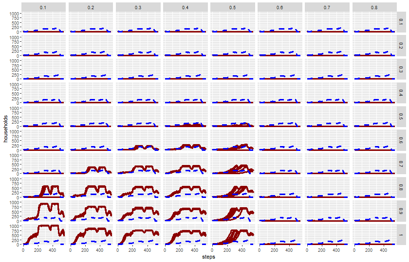
$ `harvest-adjustment` <dbl> 0.1, 0.1, 0.1, 0.1, 0.1, 0.1, 0.1, 0.1, …
$ `map-view` <chr> "zones", "zones", "zones", "zones", "zon…
$ `historic-view?` <lgl> TRUE, TRUE, TRUE, TRUE, TRUE, TRUE, TRUE…
$ `[step]` <dbl> 0, 0, 0, 0, 1, 1, 1, 0, 0, 1, 1, 2, 1, 2…
$ `total-households` <dbl> 0, 0, 0, 0, 14, 14, 13, 0, 0, 14, 14, 0,…
$ `historical-total-households` <dbl> 14, 14, 14, 14, 14, 14, 14, 14, 14, 14, …